Our brand, Our ideology
OUR IDEOLOGY, MAINLY MAINTAINED IN THE CONSTANT INNOVATION AND IN SEARCH OF THE FULL SATISFACTION OF OUR CUSTOMERS AND PARTNERS


The new logo of Tubominas intends to express our ideology, based mainly in our constant innovation and search for the total satisfaction of our clients, with quality excellence products that are the natural result of our effort. Check below:
The letter “T” symbolizes the enterprise’s name: Tubominas. At the top of the logo, it represents the vision of becoming a national and international reference in the quality of our products and services.
The letter “M” symbolizes the state of Minas Gerais, place where the enterprise was set up and has grown. Its inverted position represents the enterprise’s flexibility, while in constant modification to target the objectives of producing and offering quality solutions for its clients and partners.
The circle, strategically located in the geometric center of the logo symbolizes the client, major reason for the enterprise’s existence. It is in function of the client that the enterprise works: for his/her satisfaction and to attend his/her needs and expectations. The client is the center of attention and the enterprise turns around him/her.
The junction of the extremities of letters “T” and “M” compose arrows, in a recycling movement and continuity, which symbolize the constant innovation and transformation of the enterprise in its search for excellence in all its aspects. The angle of the arrows is exactly 135 degrees, the same angle found in the sides of an octagon, geometric figure of eight sides, which symbolize the eight values which inspire the existence of the enterprise.
The hollow spaces, resulting from the junction of the letters “T” and “M” symbolize, in a delicate way, the tubo de papelão, which is the most important product of the enterprise and to which the enterprise was first conceived. The spaces make yet the roman number two which in numerology means the union, flexibility, cooperation and adaptation, giving support to the concepts of team work and valuation of individuals as person, be it a client, a partner or a co-worker.
The overall format of the logo represents the symbol of infinite, broadly used in Mathematics, Philosophy and Theology. It means the effort of the company in trespassing barrier, winning over limitation and obstacles in its endless search for innovation, pioneering and solutions each time more complete for the clients and partners.
The shape of the logo, when turned about 90 degrees, represents the n umber eight, evidencing the eight main values adopted by the company: valuation of people; discipline; simplicity; mutual confidence; commitment; team work; participation in decision making; innovation. In numerology, number eight represents justice, equilibrium and prosperity, other values added to the ideology of the company.
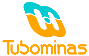
Finally, seen from a perspective, the logo symbolizes the positioning of company in being always attentive to clients’ needs, doing self-analysis from the client’s point of view. The logo is inclined upwards, representing the top as a vision of the future. It is also facing Southeast, region of origin of the company and approximate direction of the rising sun, showing that each day is a new opportunity for the company to innovate itself towards the search of excellence and of new solutions for its clients.
PRODUCT LINES AND APPLICATIONS

Circular shapes for concrete

Plastic Industries

Paper industries

Textile industries

Adhesive tapes

Stretch and Fit-plast

Fireworks industries

Siderurgical and Metallurgical

Cardboard barrel

Edge protectors